Inspiration for the project
For my school art project I wanted to-do something that used a mix of both chalk pastels and paint. This is because I thought this would something unique and new to me to progress my art skills. After some research, I found virtually nothing online to see how to-do this. (not a good start) Although the hiccup didn’t stop me form running with my idea, just meant I would half to experiment with it.
Planning my first panting
For my first panting, I wanted to-do a sunset sky like the one I saw driving down Waukesha one day. I was loved how the orange reflected of some of the clouds in the sky, and thought that would be a good first use of pastels with a panting.
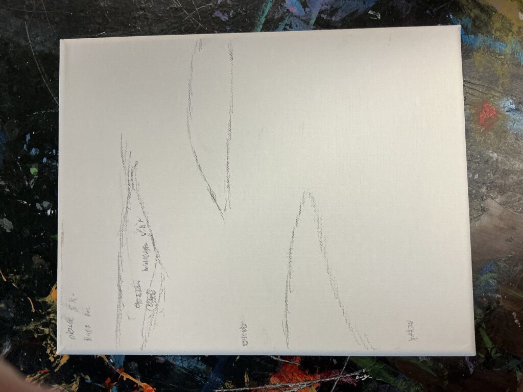
To get started I lightly sketched with a pencil of what colors I wanted to use, and where the clouds would go. In the image above you see that I left short notes of what color the cloud should be, what colors the umbrae would be and more.
In the end I didn’t do to much planning for this panting. I went this direction because I just wanted to see how the color pastels would work with the panting, and I was a bit short on time thanks to school. Either way I felt like i had a foundation I could start with when I patented the next day.
Actually panting the panting
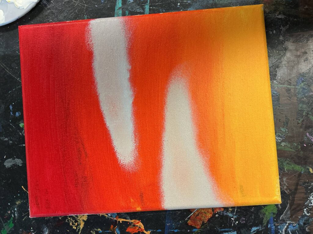
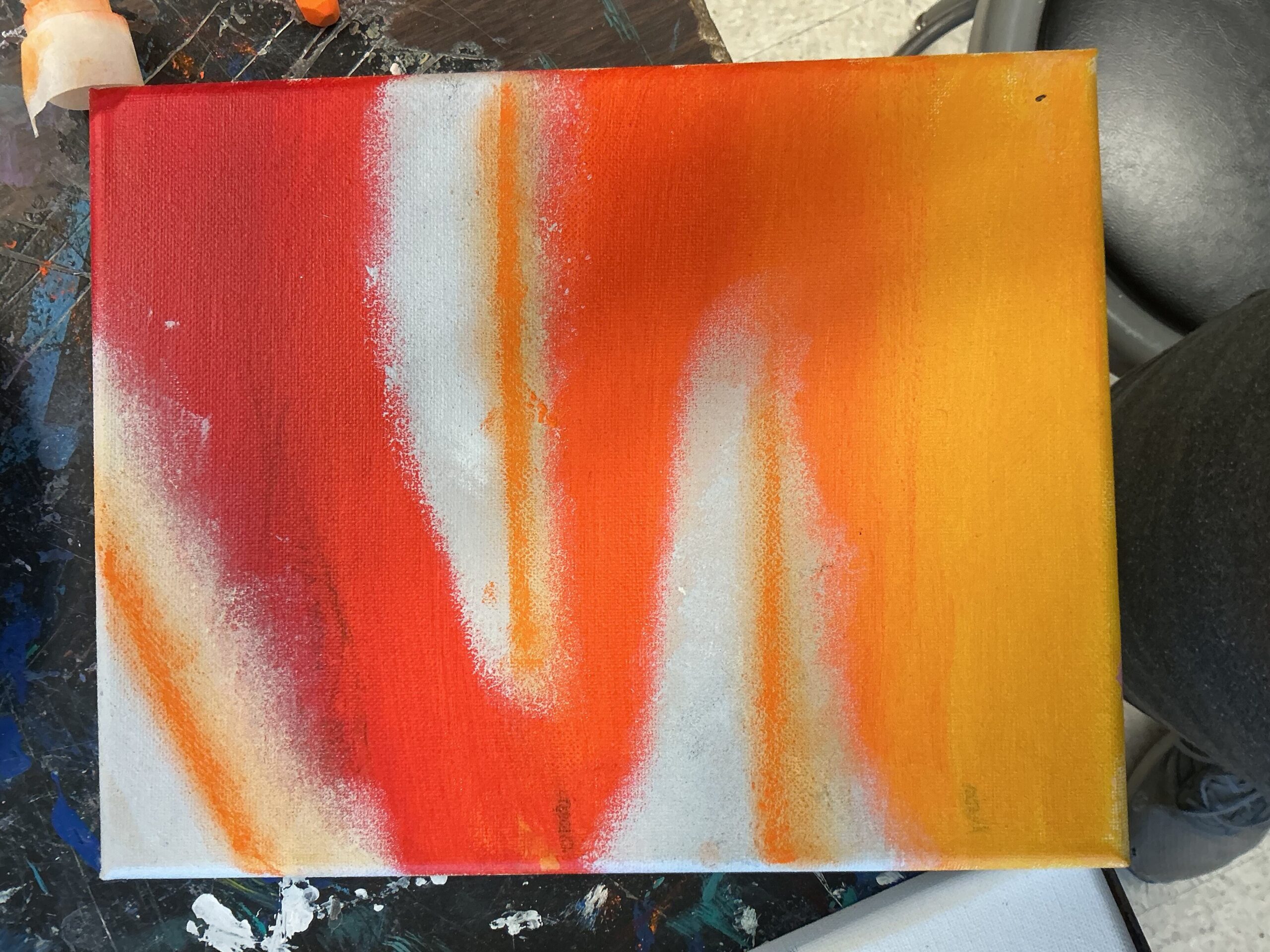
I came into my classroom excited to get started with the panting part of my first project. I got started that day with the sky umbrae. What I did was start with yellow art the bottom, and transitioned into red at the top. It was a little annoying to get it to look how I wanted at first. What helped me was to not take to long so that the paint was wet when doing the umbrae. A tip I would also recommend is to mix a transition color. What I mean is for example when doing an umbrae between orange and yellow, mix a little bit of the yellow and orange together to Put in the middle of them. This will help make it a bit smother and cleaner is what I found.
After the sky, I got started with the clouds. I mixed a bit of white paint together with a little bit of black to get that off whiteish-gray color I wanted. Then I took a sponge dip it into the paint, and the dapped the sponge on the canvas. This got me the fluffily look for the clouds, and looks a lot better then a paint brush in my opinion. What I would Recommend Is layering the clouds with mutiable colors to make then not look flat.
The Color pastels and final product

After both the clouds and the sky were done drying, I was able to get started with adding color pastels. I thought the pastels would be great for the orange highlighting on the clouds due to how bright the pastels can be. To get started I used tape to give the highlighting a sharper edge on the top, and stop form the chalk pastels form covering the whole clouds. Then I draw and on the pastels and used my finger to smooth them out while the tape still on.
After adding the color pastels I was complete with my first project of mixing pastels and paints together. My thoughts are that this was a cool idea, and I’m definitely glad that I ran with it. What I think is best is to definitely get the painting part done first, and then add the color pastels added after. Overall I have an interesting Idea that I can do in the next project.
Leave a Reply